Update · May 17th, 2024
Ragdoll Sim Controls Improvements
Hi all,

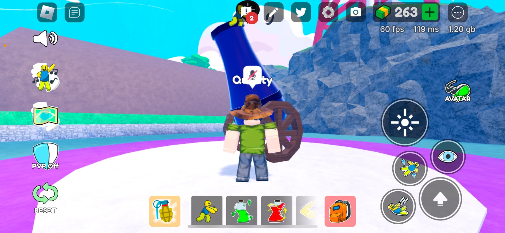
We improved the Ragdoll Sim input controls to be easier to see interactions across the game. We’re paying more attention to our base controls and input layer.
Design
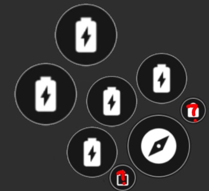
We spent a good amount of time trying different designs. We initially tried something like this.

But we thought that the design was too noisy. We then tried several other changes such as this:

Overall, we noticed that the interaction button was harder to see, and too far from the input controls.
We then updated our input control system to support and rebind to these different slots.
Thanks, Studio Koi Koi